The Nova Scotia Regional Centres for Education were looking to rebrand after a restructuring of the Nova Scotia school system. They wanted their new logos to be more unified as opposed to the logos of the previous school boards.
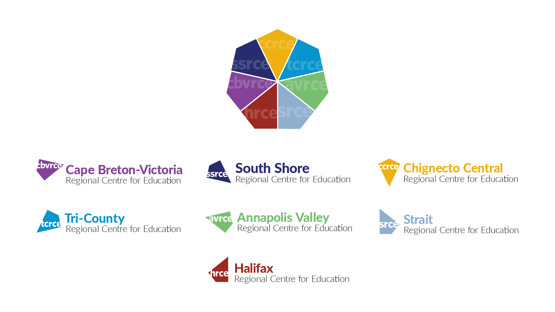
Final Result:


Process:
Old school board logos: 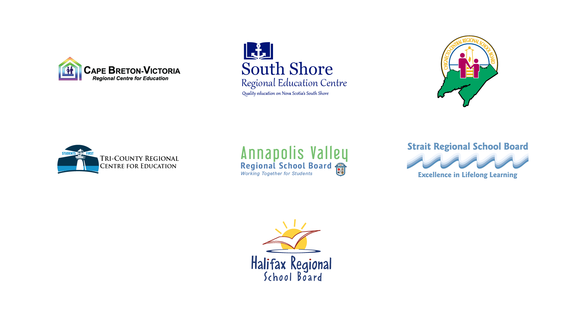
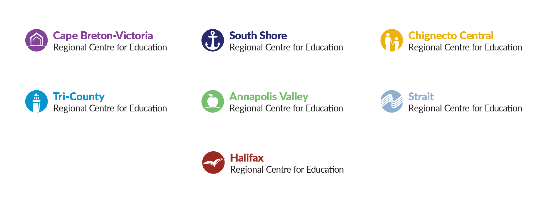
Option 1: Unified, equal, consistent, uses colours and elements from previous logos. Each logo has an element of the previous logo, but they have been refined to fit a refreshed, cohesive system.
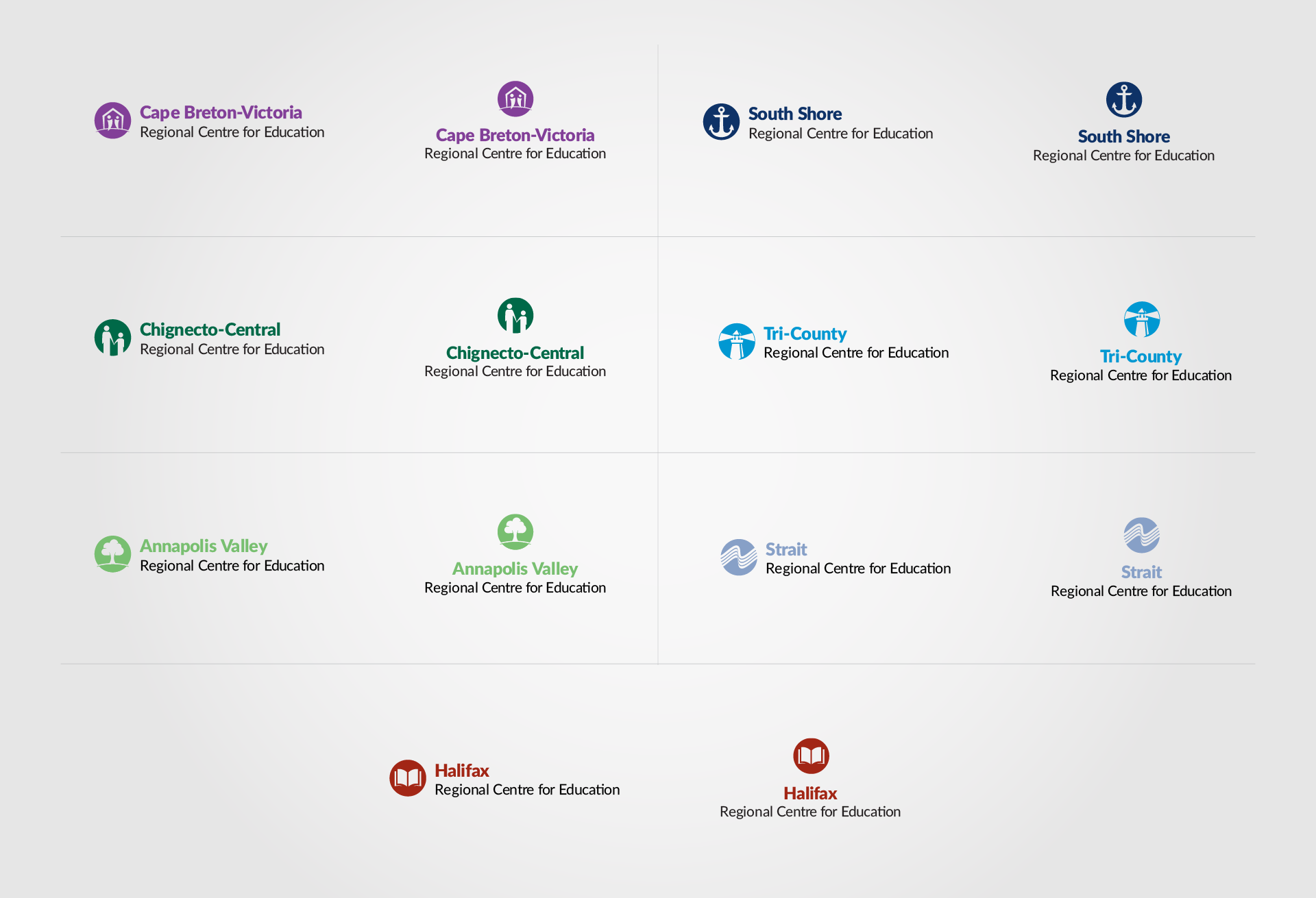
Option 2: Unified, responsive, adaptive, equal, uses colours from previous logos. Each logo is a unique shape that stands on its own, but they come together to create a whole.
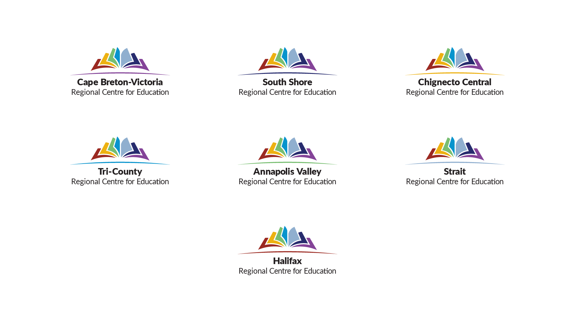
Option 3: Unified, long term, consistent, equal, uses colours from previous logos. The 7 coloured pages represent the 7 centres. They come together to create a long-standing symbol of education. The coloured line the book is resting on calls back to the school board’s previous logo.